Dither
What is dither?
Dither is a form of noise, which in some cases is applied to a digital file in order to reduce banding in solid colours, or gradients.
However, in a print, it is unwanted noise, or dots, most often visible in light tones, and the customer will often ask for this to be reduced. We can do this by adjusting the ink setting, but before we do this, we should determine exactly where the dither is.
Resolving dither in grey scales (v1)
Creating a grey out of cyan, magenta and yellow can resolve a multitude of problems, from banding and unwanted dither, to increasing the intensity of the black on a printer.
If there is no grey ink in the printer, it is always worth doing tests to see if using the black ink alone will suffice. However, it is common to want as deep a black as possible, and this involves adding some cyan, m Common problems with ink settings agenta and yellow into the black mix. When you start to do this, achieving a neutral grey can be a tricky process when there is no grey ink in the printer. So here is a tip in achieving a grey your customers should be happy with.
In the Colour Wheel window, set the Boost to 0, and in the Ink Setting Simulation window, untick Steps.
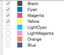
In the grey ramp window, click the Edit button and tick the Cyan, Magenta and Yellow check boxes to them to the black separation and click OK;

You will now be able to see the grey simulated clearly. The closer the colours are to the vertical black line, the more neutral the grey will be.
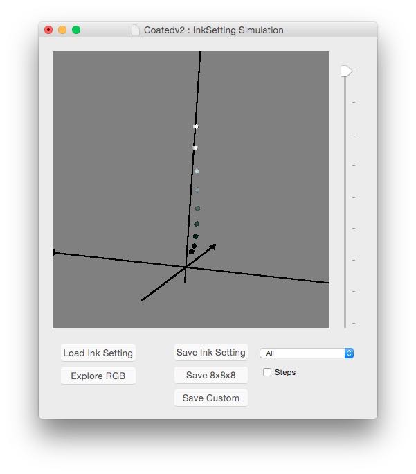
Note: If you keep Steps ticked, you will see the new black point is now much deeper in comparison to using just the black ink.
Our aim here is to use cyan, magenta and yellow to make up our grey, so that we can eliminate the use of black.
4 Begin by lowering each of the transition curves for the cyan, magenta and yellow, separating them from each other, thus making for easier selection;
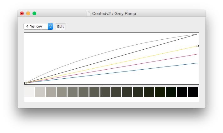
In the snapshot above, the grey is already starting to look nice, however, we need to remove the cyan, magenta and yellow from under the 100% black tone, but retain the nice mix of colour in the low tones.
Tip: Start by adding a node to half way along each of the curves. This will enable you to pull the cyan, magenta and yellow curves right down on the far right, essentially removing these inks from the 100% black.
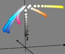
5 Now work through the inks individually, keeping a constant eye on the grey ramp along the bottom of this window to ensure your grey is not going too blue, or too red. You also need to keep the colours as central as possible around the lightness axis in the simulation window.
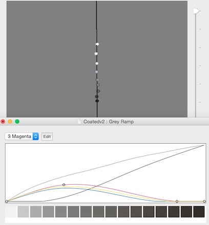
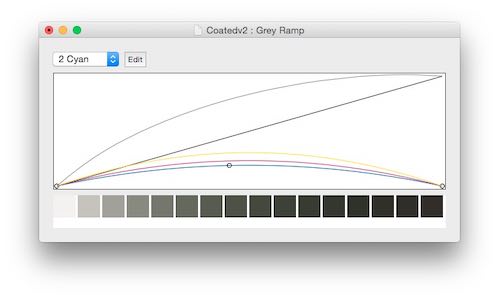
Above is a typical grey creation for a Coated Cotton fabric. You can see the gradation on the Grey ramp is nice and smooth, and the colour chips remain fairly central around the lightness axis in the simulation window. Ultimately, you are aiming to get the grey line in the graph as straight as possible.
Resolving dither in grey scales (v2)
Creating a grey out of cyan, magenta and yellow can resolve a multitude of problems, from banding and unwanted dither, to increasing the intensity of the black on a printer.
If there is no grey ink in the printer, it is always worth doing tests to see if using the black ink alone will suffice. However, it is common to want as deep a black as possible, and this involves adding some cyan, magenta and yellow into the black mix. When you start to do this, achieving a neutral grey can be a tricky process when there is no grey ink in the printer. So here is a tip in achieving a grey your customers should be happy with:
- In the Colour Wheel window, set the Boost to 0, and in the Ink Setting Simulation window, untick Steps.
- In the grey ramp window, click the Edit button and add Cyan, Magenta and Yellow to the separation;
- Click OK. You will now be able to clearly see the grey simulated. The closer the colours are to the vertical black line, the more neutral the grey will be.
 Note: If you keep Steps ticked, you will see the new black point is now much deeper in comparison to using just the black ink.
Our aim here is to use cyan, magenta and yellow to make up our grey, so that we can eliminate the use of black.
- Begin by lowering each of the transition curves for the cyan, magenta and yellow, separating them from each other, thus making for easier selection;
 In the snapshot above, the grey is already starting to look nice, however, we need to remove the cyan, magenta and yellow from under the 100% black tone, but retain the nice mix of colour in the low tones. Tip: Start by adding a node to half way along each of the curves. This will enable you to pull the cyan, magenta and yellow curves right down on the far right, essentially removing these inks from the 100% black.
- Now work through the inks individually, keeping a constant eye on the grey ramp along the bottom of this window to ensure your grey is not going too blue, or too red. You also need to keep the colours as central as possible around the lightness axis in the simulation window.

Above is a typical grey creation for a Coated Cotton fabric. You can see the gradation on the Grey ramp is nice and smooth, and the colour chips remain fairly central around the lightness axis in the simulation window. Ultimately, you are aiming to get the grey line in the graph as straight as possible.
Unwanted dots in the background of images (v1)
When dither appears in areas of a design which should be white, it can indicate a couple of things:
- This particular area is not completely white in the digital file
- Open the digital file
- Open the Info Window
- Pipette the background of your design. If there are any readings for the R,G or B in the Info Window, this proves there is tone in the background.

- If this proves these is tone, you or the customer should edit the image to remove the unwanted tone. You could gamma the background, or you could try making a selection of the white area with the magic wand and deleting that area.
- If there is no tone in the background, the Info window will display ‘0’ readings for the R, G and B.

- There is no embedded profile on the image
In this case, try using the Adobe® 1998 profile located in the following location of your hard drive;
HD / System / Library / ColorSync / Profiles
- You have the wrong embedded profile on the image
In this case, you could try embedding the Adobe® 1998 profile as above, or find out from the customer what they usually use, and embed that. If the image as come from a third party software, it may have opened with an embedded profile, and the customer may have just printed with that.
Unwanted dots in the background of images (v2)
When dither appears in areas of a design which should be white, it can indicate a couple of things:
That this particular area is not completely white in the digital file
To check this, follow these steps:
- Open the digital file
- Open the Info Window
- Pipette the background of your design. If there are any readings for the R,G or B in the Info Window, this proves there is tone in the background.

- If this proves these is tone, you or the customer should edit the image to remove the unwanted tone. You could gamma the background, or you could try making a selection of the white area with the magic wand and deleting that area.
- If there is no tone in the background, the Info window will display ‘0’ readings for the R, G and B.

You have no embedded profile on the image
In this case, try using the Adobe® 1998 profile located in the following location of your hard drive;
HD / System / Library / ColorSync / Profiles
You have the wrong embedded profile on the image
In this case, you could try embedding the Adobe® 1998 profile as above, or find out from the customer what they usually use, and embed that. If the image as come from a third party software, it may have opened with an embedded profile, and the customer may have just printed with that.
Unwanted dots in the background of images (v3)
When dither appears in areas of a design which should be white, it can indicate a couple of things:
-
That this particular area is not completely white in the digital file
- Open the digital file
- Open the Info Window
- Pipette the background of your design. If there are any readings for the R,G or B in the Info Window, this proves there is tone in the background.

- If this proves these is tone, you or the customer should edit the image to remove the unwanted tone. You could gamma the background, or you could try making a selection of the white area with the magic wand and deleting that area.
- If there is no tone in the background, the Info window will display ‘0’ readings for the R, G and B.

- You have no embedded profile on the image
In this case, try using the Adobe® 1998 profile located in the following location of your hard drive:
HD / System / Library / ColorSync / Profiles
- You have the wrong embedded profile on the image
In this case, you could try embedding the Adobe® 1998 profile as above, or find out from the customer what they usually use, and embed that. If the image as come from a third party software, it may have opened with an embedded profile, and the customer may have just printed with that.
Unwanted dots in the background of separated designs
When dither appears in areas of a separation which should be white, you should check the following:
Is the area clear?
Areas which look white, are not necessarily completely clear. To check this, follow these steps:
1 Activate all the layers in your design
2 Open the Info Window
3 Pipette an area which should be completely clear (white) and confirm the Dnn values are 0:

4 If the Info Window displays a value other than ‘0’ for any of the layers, it indicates that there is a slight tone in the background, and needs to be edited out using the gamma, or other editing tools.
Is there an image in your file?
As we move more and more into the world of Digital Print, we begin to see mixed media files being printed. That means the files are made up of images and layers.
If this is the case, you should follow the steps in the article ‘I have dither in the background of my image.’
Banding
One of the biggest problems in wide format digital printing is ‘banding.’ Gradients and solid areas of colour that print with clearly visible lines through them.
The more textured your print is, the less visible the banding is. But when you try to print solid areas of colour, particularly light colours, it can become very obvious, and prints will be rejected.
Software solution
One solution is to apply Noise filters to the design to minimize or hide the banding. The drawback is just like a great medication with a not-so-great side effect, this can produce unwanted results. Colours can shift or become less saturated, and the image may print “grainier” than originally planned.
If the bands appear to be a different colour to what you are trying to print (pink bands in a grey background) then it’s likely the greyscale in the ink setting needs to be improved.
Hardware solution
This can occasionally depend on which printer you are using.• Mimaki TS 500 – check that your dither pattern is set to Dither 1 (fine) in Colour Separation. This printer also has a MAPS (Mimaki Advanced Pass System) feature, which helps with horizontal banding. You would need to do tests, and change the MAPS setting to suit their print speed. You would not change the setting for each design.
Banding on particular substrates – Is the fabric stretchy (Lycra)? It could be that the Media Comp needs to be adjusted to compensate for the stretchiness of the substrate.
Either the Feed, or Take up roll my be too tight.
The roll of fabric may be too heavy for the printer. Check for bowing in the roll on the back of the printer.
The sticky belt (if present) may not be completely flat. This can lead to banding which is more obvious on one side of the print that the other.
Consider increasing the feed speed. If this is too slow, then the ink can dry between passes, creating an appearance of banding.
Overinking
Over inking is where the printer is ink loading is too high and could be causing the substrate to crinkle, or for the ink to bleed, resulting in poor quality prints.
Ink loading refers to the total amount of ink that the substrate will handle at any given time, without causing issue to the said substrate. It is important that ink loading is controlled carefully to reduce such issues and ensure as much accuracy as possible in the final profile. Dependant on the type of printing and substrate, such issues could include:
- Bleeding or pooling of ink: a generic trait for many processes
- Ink coming through to the back of the substrate: direct to fabric, reactive, acid
- Cockling / rippling: pigment, thinner substrates such as vinyl, wall coverings
- Unsuccessful fixing processes: transfer sublimation – too much ink left on the paper after transferring / reactive or acid process – bleeding ink after steaming or washing / pigment – ink rubbing off after heat treatment.
If there is an issue with overinking, usually the solution is to look at the printer linearisation and reduce the total amount of ink going down.